POGO
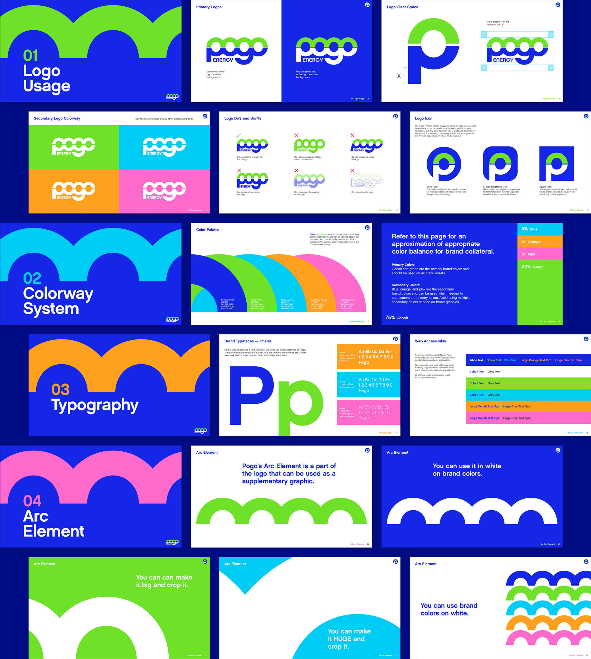
Pay-as-you-go energy is a new concept to most people. And for those who have heard of it, it tends to come with some baggage. Our challenge was to demystify the pay-as-you-go concept while introducing Pogo Energy as a trusted and convenient energy provider that keeps their customers in control. To achieve this, we took a two-step approach. First step: rebranding. We modernized the logo by adding a playful bounce element with pops of color that made Pogo Energy stand apart from their competition. Step two: disrupt the conversation by bringing their no-nonsense, challenger voice to life and encourage a whole new audience to bounce over to Pogo.


